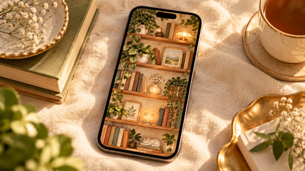
These shelf wallpaper aesthetic ideas make opening your phone feel more personal, with designs that turn app icons into objects on shelves.
Instead of apps floating over a random photo, they can look like tiny objects sitting on shelves, tucked into alcoves, lined up inside a glass cabinet, or resting beside books and plants.
And no, every design does not need to be another brown bookcase with three books and one lonely plant.
We can do better than that.
The 20 ideas below move through completely different moods, materials, colors, and little visual stories. Some are calm. Some are playful. A few are delightfully odd.
Pick the one that makes you stop and think, “Yep. That feels like my phone.”
A good shelf wallpaper aesthetic should do more than give you a row of shelves.
It should feel like a tiny place you would want to peek into again.
Here are 20 directions that give you that feeling without repeating the same idea twenty times.
What it is: A small built-in reading corner that feels sunny, warm, and lived in.
This one is for the person who would happily disappear into a little nook with a book and forget the rest of the house exists for an hour.
Create: Use a soft cream plaster arch with curved built-in shelves and warm oak ledges. Add stacked books, linen cushions, one tiny candle, a folded throw, and a small dog curled up near the bottom.
Let warm afternoon sunlight fall across the wall. Keep two shelf rows quieter so your icons have somewhere to sit without landing across the dog’s face.
If this mood is your favorite, these cozy reading nook ideas can give you more ideas for warm colors, little corners, books, and soft details.
Colors: cream, warm oak, muted rust, dusty blue.
Why it works: The architecture gives the wallpaper interest before you add a single app.
What it is: An old cabinet filled with bottles, herbs, drawers, and small strange objects that look as though somebody has been collecting them for years.
Create: Use almost-black wood with glass cabinet doors. Add amber bottles, handwritten labels, bundles of dried herbs, tiny drawers, an old mortar and pestle, one candle, and a few empty compartments.
Keep the glass slightly cloudy rather than shiny and new.
The empty compartments become natural homes for app icons.
For more ideas around dark curves, glass, rich color, and old-world details, the dark Nouveau bedroom ideas are a useful next stop.
Colors: black-brown, amber, olive, parchment.
Why it works: It feels mysterious without becoming another dark library.
What it is: A sunny wall of built-in niches inspired by warm Mediterranean homes.
No bookcase needed.
Create: Use thick white plaster with rounded wall niches edged in blue and terracotta tile. Place a bowl of lemons in one niche, striped pottery in another, then add an olive branch, hand-painted plate, and folded linen cloth.
Let bright midday sun leave strong shadows around each opening.
Keep a few niches nearly empty so your apps look as if they were placed there on purpose.
Colors: chalk white, cobalt blue, terracotta, lemon yellow.
Why it works: The phone feels architectural rather than decorated.
What it is: A tiny artist’s pottery room where each shelf looks mid-project.
It should feel like somebody just stepped away for tea.
Create: Use unfinished wooden shelves with irregular bowls, glaze jars, clay tools, a partly painted mug, small pigment pots, and one crooked little vase.
Let the pottery have tiny dents and uneven edges. That is part of the charm.
Leave one wide area almost empty for a larger widget.
Colors: clay, chalk, faded blue, moss, warm white.
Why it works: The scene feels active. Things are being made, not simply displayed.
What it is: A quieter nature-study wall filled with delicate plant samples rather than big leafy pots.
Create: Use narrow wooden ledges against a faded parchment background. Add framed pressed ferns, tiny wildflowers, seed envelopes, handwritten botanical notes, glass specimen jars, and small paper labels.
Keep everything thin and airy.
This works well if you want a green look without vines covering half your apps.
Colors: sage, parchment, faded brown, cream.
Why it works: It gives you botanical detail without making the screen feel crowded.
What it is: A tiny record store instead of a bookshelf.
This is for the person whose saved music list is longer than their grocery list.
Create: Use low wooden record bins and shelves with album covers facing outward. Add cassettes, old ticket stubs, chunky headphones, a handwritten “new arrivals” card, and one little stack of vinyl.
Let app icons sit between the album covers like part of the display.
Colors: burnt orange, mustard, teal, cream, black.
Why it works: Album art already comes in square shapes, so it plays nicely with app icons.
What it is: A tiny night-sky study filled with moons, stars, charts, and old astronomy objects.
Create: Use deep navy shelving with a brass moon model, small star maps, constellation cards, a glass orb, telescope pieces, and silver markers.
Keep the background dark but leave some quieter navy sections behind the apps.
A few soft stars are enough. Your phone does not need to look like the entire galaxy exploded on it.
Colors: midnight blue, brass, silver, deep plum.
Why it works: The dark background can make lighter app icons easy to spot.
What it is: A shelf scene that looks as if someone built the whole thing from scissors, paper, and glue.
Create: Make the books, flowers, frames, shelves, plants, and tiny animals from layered paper.
Let edges look slightly torn. Show folds. Add small shadows between each paper layer.
Try a tiny paper bird perched on one shelf rather than another plant pot.
Colors: coral, ochre, dusty blue, forest green, cream.
Why it works: The handmade surface looks playful even before you add bright icons.
What it is: A wallpaper that looks stitched onto fabric instead of painted or photographed.
Create: Start with warm linen. Stitch shelf lines across it, then add thread-made books, flowers, baskets, tiny frames, leaves, and little decorative shapes.
Use thicker yarn on a few objects so they appear raised from the background.
Keep the app areas simpler, with less stitching.
Colors: oatmeal, berry, moss, navy, peach.
Why it works: The fabric texture makes even a simple layout feel unusual.
What it is: A funny, soft little world made from clay.
Nothing should look perfectly straight.
That is the point.
Create: Use rounded clay shelves with tiny handmade fruit, lumpy vases, little books, chunky flowers, boxes, and a miniature dog figurine.
Leave fingerprints in the clay. Let one book lean. Make one mug slightly too big.
That little bit of awkwardness gives it personality.
Colors: butter yellow, tomato red, cobalt, sage, cream.
Why it works: The 3D clay shapes feel playful without needing a packed background.
What it is: A glowing grid that feels halfway between shelving and a stained-glass window.
Create: Build thin dark frames around jewel-colored glass panels. Add a few simple silhouettes such as birds, flowers, stars, and small vases.
Do not fill every panel.
Leave calmer pieces of colored glass behind the app rows so the icons stay easy to see.
Colors: ruby, cobalt, emerald, amber, violet.
Why it works: Color comes from the glass itself instead of piles of objects.
What it is: A shelf filled with things that look gathered from real days near the water.
Skip the wooden “BEACH” sign. We know where we are.
Create: Use sun-bleached shelves with sea glass, shells, a little driftwood frame, folded postcards, a faded coastal map, smooth stones, and one pale ceramic bowl.
Let bright sunny light fall across the scene.
Colors: sand, aqua, sea-glass green, chalk white.
Why it works: It feels personal, like somebody kept small pieces of favorite trips.
What it is: A little cabinet where every shelf hints at a different trip.
Create: Add a film camera, old luggage tag, railway ticket, postcards, a brass compass, tiny globe, folded map, and a few worn matchbooks.
Do not fill the final shelf.
Leave it almost empty, as though another trip still belongs there.
Colors: tobacco brown, faded red, cream, moss green.
Why it works: There is a small story running from one shelf to the next.
What it is: A miniature bakery window for the person who likes cute things but does not want another pink bedroom wallpaper.
Create: Use pale shelves with cake stands, macarons, small pastry boxes, little jam jars, ribbon, handwritten cards, and striped awning details.
Keep the pastries near the edges and leave the centers open for apps.
If you like softer phone backgrounds too, the pink phone wallpaper ideas offer another direction without repeating this bakery look.
Colors: pistachio, strawberry pink, cream, chocolate brown.
Why it works: It feels like a tiny shop window rather than home decor.
What it is: A calm gallery look for someone who wants less visual noise but still wants personality.
Create: Use warm plaster with wide sculptural ledges. Put only one object on each level: a ceramic form, curved stone piece, tiny bust, folded paper shape, or smooth vessel.
Give every object room around it.
If you like calm palettes without making everything beige and sleepy, these warm neutral decor ideas are good inspiration for mixing texture, shape, and quiet color.
Colors: limestone, sand, warm gray, bone white.
Why it works: The apps can become part of the gallery instead of fighting it.
What it is: A glossy early-2000s display made from transparent acrylic and shiny little objects.
Create: Use clear shelves with CDs, translucent boxes, chrome details, frosted plastic shapes, small bubble forms, and colorful cases.
Keep some pieces almost see-through so the wallpaper does not become too busy.
Colors: aqua, hot pink, silver, violet, clear acrylic.
Why it works: It gives you a completely different material from wood, stone, paper, or fabric.
What it is: A flat hand-painted shelf scene filled with pattern, birds, flowers, fruit, and decorative shapes.
Create: Paint scalloped shelf edges, floral borders, small birds, fruit bowls, patterned books, tiny houses, and painted pottery.
Let the drawing stay flat rather than trying to look photographic.
Each shelf can tell a tiny story.
Colors: brick red, deep blue, ochre, cream, leafy green.
Why it works: It feels like folk illustration turned into a phone background.
What it is: A mini glass plant cabinet rather than loose shelves filled with houseplants.
Create: Use slim black metal framing with clear or slightly fogged glass. Add propagation bottles, moss, hanging vines, terracotta pots, small ferns, and one climbing plant.
Leave clean sections of glass behind the main app rows.
If you want more ideas for mixing greenery with shelves without making everything feel crowded, see these style shelves with plants.
Colors: deep green, terracotta, clear glass, black.
Why it works: The glass frame gives the plants structure.
What it is: A happy little cabinet filled with things that look chosen over time rather than bought in one afternoon.
Create: Mix art cards, tiny frames, ribbons, charms, strange ceramics, postcards, flowers, books, little boxes, and odd souvenirs.
Give each shelf its own color group.
Then leave one clear pocket per row for apps.
For more inspiration on making a space feel personal instead of staged, these personal apartment aesthetic ideas are worth a look.
Colors: saturated red, blue, pink, green, yellow.
Why it works: The objects feel personal, but the clear app pockets stop the screen from turning into visual soup.
What it is: The cleanest idea here.
The wallpaper does less so your real apps can do more.
Create: Use thin floating shelves against a soft background with realistic shadows. Add almost nothing else.
Put one small object near the edge of a few rows—a pebble, tiny folded card, little vase, or single leaf.
Your app icons become the display.
Colors: cream, greige, charcoal, soft sage.
Why it works: If your Home Screen is packed with apps, this one is forgiving.
It also makes a good app shelf wallpaper when you care more about organization than tiny decorative details.
A shelf wallpaper aesthetic can look beautiful by itself and completely fall apart once the icons arrive.
The wallpaper is only half the design. Your apps, folders, and widgets finish it.
You do not need to fill every corner.
Empty shelf space gives app icons somewhere to “live.”
That is why an empty bookshelf wallpaper can work better than a highly detailed scene when your Home Screen has several rows of apps.
Set the wallpaper.
Move two or three apps.
Look at it.
That tiny test can save you from moving 28 icons only to discover your weather app is sitting halfway through a ceramic vase.
A square widget needs more breathing room than one app icon.
If you use weather, calendar, photos, or another larger widget, choose a design with at least one broad quiet area.
Some current wallpaper collections even make separate versions around different widget placements. If you want to see how creators handle that, these bookshelf wallpaper examples are a useful reference.
Your wallpaper should not force you to hunt for Spotify.
If your icons are pale, use a mid-tone or darker area behind them.
If your icons are dark, lighter shelves can help.
You do not need perfect color theory. You just need enough difference to see what you are tapping.
| If your Home Screen is… | Choose… | Skip… |
|---|---|---|
| Full of apps | Clear shelf rows | Tiny objects everywhere |
| Widget-heavy | Wide open areas | Lots of narrow compartments |
| Mostly empty | Richer scenes | Shelves that feel unfinished |
| Using dark icons | Lighter shelf areas | Dark objects behind every app |
| Using light icons | Mid-tone or darker areas | Pale shelves with little contrast |
| Changed often | Flexible open shelves | Designs needing exact icon positions |
The effect works best when you treat the shelf lines as guides rather than decoration.
Put three or four icons on one shelf.
If they look right, continue.
If they are floating above the shelf or sinking through it, fix the wallpaper crop before moving anything else.
If your wallpaper has lots of detail, keep the app arrangement simple.
If the wallpaper is quiet, colorful icons can become the decoration.
That one choice can stop the screen from feeling busy.
A widget looks better when it has its own little zone.
Do not squeeze one across three tiny shelf compartments just because there is technically space.
It will look like somebody parked a sofa in a hallway.
Move or resize the wallpaper slightly and test again.
A small shift can fix the whole arrangement.
Choose a wallpaper with wider shelf bands or fewer fixed compartments.
A flexible bookshelf wallpaper for apps is usually easier to live with than one designed around one exact screen layout.
The same shelf wallpaper aesthetic idea can work across different devices, but the spacing may change.
Modern iPhone Home Screens give you more freedom to place apps around your wallpaper, which is one reason the bookshelf Home Screen trend became so popular.
If you need the actual steps rather than design ideas, this guide on how to customize your Home Screen walks through the current options.
For the wallpaper itself, keep things simple:
Android layouts can vary by phone and launcher.
That is why a flexible Android shelf wallpaper is usually a better choice than one with tiny compartments designed around one exact icon grid.
Pick wider shelves.
Give yourself room to move things.
An iPad shelf wallpaper needs more horizontal room than a phone version.
If you use your iPad in both portrait and landscape, test both before you spend time arranging everything.
A wider cabinet, gallery wall, greenhouse, or museum-plinth idea can work especially well on a larger screen.
Your Lock Screen does not need the same crowded shelf scene.
In fact, it often looks better when the two screens feel related without being twins.
Try these pairings:
You can also look at these clock shelf wallpaper ideas if you want to see designs that leave space around Lock Screen elements.
Think “same little universe,” not “same exact picture twice.”
Still torn between five of them?
Use your current Home Screen as the clue.
The museum wall, app-first shelves, pressed botanicals, or Mediterranean niches give bright app icons room to breathe.
If you keep only a handful of apps on the first page, you can get away with more detail.
That is where the travel cabinet, maximalist display, record shop, or apothecary can shine.
Paper, embroidery, clay, glass, and acrylic immediately move the design away from standard bookshelf wallpaper.
If your actual home leans calm and neutral, you may like the museum-plinth look. These warm neutral decor ideas show how quiet color can still have personality.
If your taste runs darker and more dramatic, the apothecary or celestial cabinet may feel closer to you.
Do not pick an aesthetic because everybody else saved it.
You have to look at this screen every day.
When you save a shelf wallpaper aesthetic, use the largest image available.
A screenshot may look fine at first, then turn soft or fuzzy once your phone crops it.
A few simple habits help:
If you want another phone-wallpaper direction after this one, these pink phone wallpaper ideas move into a completely different visual mood.
A shelf wallpaper aesthetic is a phone background designed to make apps, widgets, or folders look as if they are sitting on shelves, inside niches, or within a display layout.
Some are literal bookshelves.
Others use cabinets, alcoves, glass panels, floating ledges, or other structures to create the same idea.
No.
The wallpaper is only the background.
You still move your apps and widgets where you want them.
Your screen size, crop, icon size, or grid spacing may be different from the device used to make the wallpaper.
Try adjusting the image first.
If the rows still miss, choose a design with wider open shelf areas.
Sometimes.
If your first Home Screen has lots of apps, an empty or mostly empty design can look cleaner because the apps become the objects on the shelves.
If you only keep a few icons on the page, a more decorative scene may suit you better.
Yes.
Just remember that Android layouts can vary between phones and launchers, so a flexible design usually works better than one built around exact icon slots.
Yes.
Choose a wider image or one with roomy shelf areas. A phone wallpaper may crop strangely on a tablet, especially in landscape.
It can, but it does not need to copy the Home Screen.
A simpler image from the same color palette or theme often feels more polished.
The best shelf wallpaper aesthetic is not the one with the most books, flowers, trinkets, or trendy colors.
It is the one that makes sense when your real apps arrive.
Maybe that is a sunny little reading alcove.
Maybe it is a strange apothecary cabinet.
Maybe your phone deserves a miniature pastry shop because life is already serious enough.
Pick the idea that makes you smile, test a few icons on it, and then build the rest from there.
Save or Pin your favorite before you start moving everything around.