



Wondering what colors go with white walls? Start with the warmth of your existing white, then choose supporting colors that work with the room’s wood, flooring and furniture.
White walls seemed like the easy part. Then the curtain samples arrived, one beige looked yellow, one gray looked blue, and the navy that looked calm online suddenly covered half the room.
If you are wondering what color curtains go with white walls, start with white, ivory, beige, taupe, gray, sage, blue, terracotta, dusty pink, mustard, or brown. The best choice depends on four things: the undertone of the white, how much contrast you want, the other large colors in the room, and how sheer or dense the curtain fabric is.
White and ivory are the easiest low-contrast choices, while beige, taupe, gray, green, blue, terracotta, pink, mustard, and brown add more separation from the wall. Pick the family by deciding whether you want the window to blend in, warm the room, cool the palette, or become a darker feature.
The curtain does not need to match the wall. It needs to make sense beside the wall and the room’s larger pieces.
Warm and cool whites react differently beside the same curtain color. Benjamin Moore explains that warm whites can carry red, orange, or yellow undertones, while cool whites can carry green, blue, or violet undertones in its understanding white undertones guide.
Warm white walls are a good starting point for oatmeal, beige, warm taupe, tan, brown, terracotta, rust, olive, muted mustard, dusty rose, and ivory. These colors repeat or sit close to warmer notes already present in the wall.
A cool curtain can still work beside warm white when you want contrast. Test it in the room first so the wall does not suddenly look more yellow than you expected.
Cool white walls can work well with soft gray, charcoal, navy, dusty blue, blue-green, cooler sage, black, and cooler off-white curtains. These choices can keep the palette crisp or introduce darker contrast without adding a strong yellow note.
If a cool white room already feels chilly, you do not have to stay with cool curtains. A warmer fabric may balance the room, but compare it with the wall and the largest furniture piece before you commit.
A white with little visible undertone gives you more freedom between warm and cool curtain families. Your sofa, rug, floor, wood finishes, and desired level of contrast can then guide the final choice.
If you want to choose the larger room palette first, see these colors with white walls before narrowing the decision to curtains.
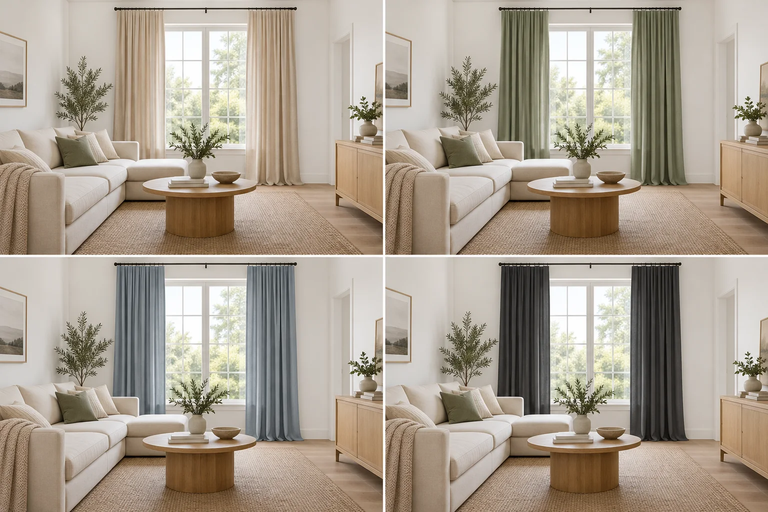
When deciding what color curtains go with white walls, the strongest starting families are white, ivory, beige, taupe, gray, green, blue, terracotta, dusty pink, mustard, and brown. The final effect changes with the undertone, fabric, and amount of curtain covering the window.
White-on-white works when you want the window to blend into the wall and keep the room light. Give the curtains enough difference in texture, opacity, or tone so the window still looks intentional.
Crisp white sheers often sit comfortably beside cooler whites, while ivory or soft off-white can suit warmer whites. Linen texture, woven fabric, or a slightly warmer tone can keep the pairing from looking flat.
Best for: low contrast, light rooms, quiet neutral palettes.
Watch for: yellow ivory against a strongly blue-white wall when that contrast is not what you want.
Beige and oatmeal warm up white walls without adding a strong color. They are useful when the room already contains tan upholstery, light wood, woven pieces, or warm flooring.
Choose beige by looking at the undertone rather than trusting the name on the sample. Pink-beige, yellow-beige, and gray-beige can each look different against the same white wall.
Best for: warm whites, neutral whites, natural textures.
Watch for: a beige that makes the wall look dingy or much more yellow.
Taupe and greige sit between warmer and cooler neutrals, so they can add definition while keeping the room restrained. They are useful when beige feels too warm and gray feels too cool.
Choose a lighter greige when you want the curtains closer to the wall, or a deeper taupe when you want the window to carry more weight. Repeat a similar tone in a rug, cushion, or upholstered piece when the room needs a clearer connection.
Best for: neutral living rooms, mixed wood tones, softer contrast.
Watch for: taupe with a strong purple or pink lean that fights the wall color.
Gray can create anything from soft separation to a darker frame around the window. Charcoal and black make the window more noticeable and usually work better when darker details already appear elsewhere in the room.
Soft gray is easier in a bright room, while charcoal can relate to black frames, dark furniture, or a patterned rug. Use black carefully across a wide window because a large dark fabric area can become one of the strongest features in the room.
Best for: cool or neutral whites, modern palettes, dark furniture.
Watch for: blue-gray curtains beside creamy white when you do not want a clear warm-cool difference.
Green adds color to white walls without requiring a bright room palette. Sage is softer, olive is warmer and earthier, while forest or emerald green creates deeper contrast.
Sage or olive can sit well with wood, cream, tan, and woven finishes, while dark green works when the room already contains deeper furniture or artwork. Choose the green from the room around it rather than assuming every green will suit every white.
Best for: natural palettes, warm woods, muted rooms.
Watch for: cool minty green beside warm white if the difference feels too sharp.
Blue gives you a wide range, from pale dusty blue to deep navy. Lighter blues keep the window softer, while navy makes it a clear part of the color scheme.
Navy can relate well to dark blue, black, walnut, or cool-gray details already in the room. Dusty blue is easier when you want color but do not want the curtains to dominate the wall.
Best for: cool or neutral whites, coastal-inspired rooms, darker contrast.
Watch for: pale blue, cool white, and gray flooring together if the room begins to feel too cold.
Terracotta and rust add red, orange, and brown notes to a white room. They are natural partners for warm white, cream, tan, medium wood, and earthy rugs.
These shades are useful when a pale room needs one stronger warm color. If the white leans blue, compare the fabric beside the wall first because the warm-cool difference may become more obvious across full-height panels.
Best for: warm whites, earthy rooms, wood-heavy spaces.
Watch for: adding too many other strong warm colors at once.
Dusty pink and muted rose add warmth without the brightness of clear pink. They can suit living rooms, bedrooms, reading areas, or dining spaces when the rest of the palette stays calm.
Pair them with warm white, taupe, walnut, oak, cream, or softened green. A grayer dusty rose usually creates a quieter result than a brighter pink.
Best for: warm or neutral whites, soft color palettes.
Watch for: repeating pink across too much large furniture unless that is the palette you want.
Mustard and ochre give white walls a stronger warm accent. They make more sense when warm wood, brown, cream, rust, or muted green already appears somewhere else in the room.
Because curtains cover a large area, a softened mustard is often easier to live with than bright lemon yellow. Look at the fabric with the curtains open and closed before deciding how much yellow the room can carry.
Best for: warm or neutral whites, earthy palettes, rooms needing a clear accent.
Watch for: bright yellow beside cool white when the difference feels too sharp.
Brown curtains give white walls deeper warmth and can relate well to tan leather, walnut furniture, darker wood floors, or cream upholstery. Chocolate creates stronger contrast, while camel and medium brown feel softer.
Dark brown can make a large window more defined without using black. In a room with little daylight, consider a lighter brown or fabric with visible texture.
Best for: warm whites, darker wood, traditional or earthy rooms.
Watch for: dense dark brown fabric when the room already feels dim.
Use this chart when you know the feeling you want but have not settled on a curtain family yet.
| If you want… | Try… | White base to test first | Result |
|---|---|---|---|
| Little contrast | White or ivory | Any, after undertone check | Tonal and light |
| More warmth | Beige or oatmeal | Warm or neutral white | Soft and warm |
| Neutral definition | Taupe or greige | Warm or neutral white | Quiet contrast |
| Cooler contrast | Gray or charcoal | Neutral or cool white | Clean and defined |
| Natural color | Sage or olive | Warm or neutral white | Muted color |
| Strong cool color | Navy | Neutral or cool white | Dark contrast |
| Earthy warmth | Terracotta or rust | Warm white | Warm contrast |
| Soft warm color | Dusty rose | Warm or neutral white | Gentle color |
| Strong warm accent | Mustard or ochre | Warm or neutral white | Noticeable warmth |
| Dark earthy contrast | Brown or chocolate | Warm or neutral white | Deep warmth |
Neither choice is automatically better. Lighter curtains blend more closely with white walls, while darker curtains make the window a stronger part of the room’s color scheme.
Choose light curtains when you want low contrast, the furniture already carries the darker colors, or you want the window treatment to recede visually. White, ivory, oatmeal, pale greige, and soft gray are easy starting points.
Choose darker curtains when the room needs a clear color anchor or when dark furniture, frames, floors, or artwork already create contrast. Navy, charcoal, forest green, chocolate, and deeper rust work best when they connect to another large or repeated color in the room.
Curtain color is only part of what you see because opacity changes how much daylight passes through the fabric. IKEA separates curtains into sheer, light-filtering, room-darkening, and blackout options, with each level changing how much daylight reaches the room.
A sage sheer can therefore look much softer than a dense sage room-darkening panel across the same window. A white sheer may nearly merge into a white wall, while textured ivory or lined beige can form a clearer layer.
If privacy is part of your decision, check that at the same time as color. A pale sheer may suit the palette but not suit a bedroom or street-facing room where more privacy is needed.
For a quick breakdown of those differences, use this curtain opacity guide. IKEA notes that light-filtering curtains still allow outside light through while room-darkening and blackout options reduce much more of it.
The walls are only one part of the room, so compare the curtains with the sofa, rug, floor, wood finishes, and large artwork too. Pottery Barn’s choosing curtain colors guidance similarly recommends considering items such as rugs and throw pillows when choosing curtain color or pattern.
The curtains do not need to copy the sofa exactly. They can repeat a smaller color from the rug, relate to a wood tone, or sit one step lighter or darker than another neutral already in the room.
If your room is mostly beige, cream, flax, or soft gray, these neutral living room ideas can help you place the curtains within the larger palette. The current Family Haven Studio article already uses oatmeal, flax, soft white, gray, linen, and sheer window treatments as part of its neutral-room examples.
If you are still asking what color curtains go with white walls, check for these problems before ordering full panels. Most disappointing pairings happen when the curtain is judged as an isolated swatch rather than one of the room’s largest fabric surfaces.
Beige is not one single color. Compare the sample against the white because beige fabric can lean yellow, pink, gray, or brown.
A curtain labeled white can still look creamier, grayer, or bluer than the wall. White-on-white works better when the difference looks deliberate instead of accidental.
A screen is not a reliable substitute for the real fabric beside your wall. Benjamin Moore also notes that on-screen paint representations can differ from actual paint colors, which is another reason to compare physical samples when undertones matter.
A small navy swatch can look restrained, but two full-height panels create a much larger field of color. Think about how much of the wall the closed curtains will cover.
Your curtains, sofa, rug, and cushions do not need to be the same shade. Related colors can repeat across the room without every fabric looking like it came from one matching set.
Sheer, light-filtering, room-darkening, and blackout curtains behave differently at a window. Decide how much daylight and privacy you need before choosing a color that is only available in the wrong fabric type.
Yes. White curtains can look soft beside white walls, especially when texture, weave, opacity, or a slight tonal difference separates the fabric from the paint.
If the wall is warm white, compare crisp white and ivory samples before choosing. A blue-leaning white curtain can make a creamy wall appear more yellow.
Yes, beige curtains can work well with warm and neutral white walls. Check the beige undertone beside the wall because yellow-beige, pink-beige, and gray-beige fabrics can react differently.
If beige feels too warm, try oatmeal, greige, or taupe before moving to gray.
Yes, especially with neutral or cool whites. Soft gray gives mild contrast, while charcoal creates a darker frame around the window.
With warm white walls, a warmer greige or taupe may sit more naturally than a blue-gray.
Beige, oatmeal, warm taupe, brown, terracotta, rust, olive, muted mustard, dusty rose, and ivory are good starting points. Warm wood and tan furniture can support the same direction without adding another strong curtain color.
They do not need to match either one exactly. Choose a curtain color that relates to the wall, sofa, rug, floor, or another repeated color so the room feels connected.
A blue sofa can work with ivory curtains, for example, while a neutral sofa may leave room for navy or sage curtains to carry more of the color.
Oatmeal, beige, warm taupe, brown, terracotta, rust, olive, muted mustard, dusty rose, and ivory are easy places to begin. Cooler colors can still work when you want contrast, but compare them with the wall first.
Soft gray, charcoal, navy, dusty blue, blue-green, cooler sage, black, and cooler off-whites can pair naturally with cool white walls. If the room already feels cold, mix in warm wood, tan, or another warmer finish to soften the palette.
The pile of curtain samples gets easier to sort once you stop asking which color looks good by itself. When choosing what color curtains go with white walls, read the white first, decide how much contrast you want, check the fabric opacity, and compare the sample with the room’s largest existing colors.
Your next step is simple: place the actual curtain sample beside the white wall and your sofa or rug, then check it during daylight and again with the room lights on. The curtain does not need to copy the wall, it needs to belong in the room.