
POPULAR AT FAMILY HAVEN
POPULAR AT FAMILY HAVEN
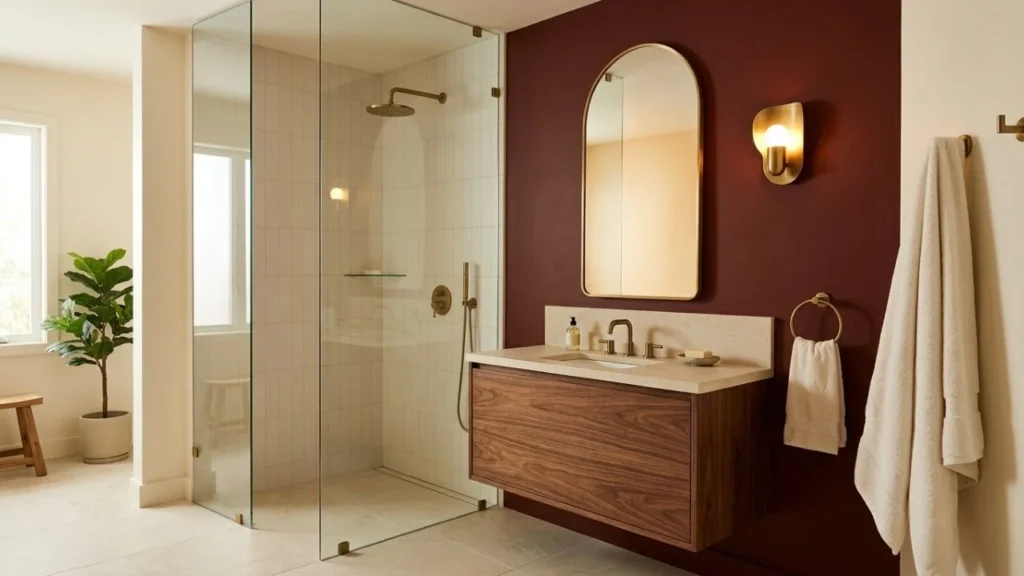
The best red bathroom ideas start with the exact shade, not the word “red.” Burgundy can work almost like navy or brown, brick red feels earthier, wine red can lean cooler, and red marble brings its own pattern. Check your floor, tile, countertop and bathroom lighting first, then decide how permanent you want the red to be.
Red can look gorgeous in somebody else’s bathroom and suddenly feel much more serious when the paint sample is sitting in your hand.
Because “red bathroom” could mean a burgundy vanity beside pale oak.
Or brick-red tile with travertine.
Or a wine-colored powder room with chrome.
Or one red-marble vanity top carrying almost the entire palette.
Those rooms have little in common beyond belonging to the same broad color family.
When you look through red bathroom ideas, I would not start by asking, “How much red can I fit in here?”
I would start with:
Which red already makes sense beside the things in this bathroom that are staying?
That one question can save you from choosing a beautiful paint color that fights the floor, a red tile that makes the countertop look yellow, or an expensive stone you loved online but dislike every night under your vanity lights.
And yes, you can use red in a small bathroom.
You can use it in a rental.
You can pair it with pink.
You can keep your chrome.
The room simply needs a plan.
Affiliate disclosure: This post contains Amazon links. We may earn a commission from qualifying purchases at no added cost to you.
Your existing bathroom gets a vote before the paint card does.
Start with the pieces you are not planning to replace:
Then choose your red beside those materials.
| If you want… | Start with… | Pair it with… | Watch for… |
|---|---|---|---|
| Moody and rich | Burgundy | Cream, oak, brass | Too many dark surfaces |
| Earthy and warm | Brick red | Travertine, walnut, beige | Orange undertones fighting cool gray |
| Deep and polished | Wine red | Marble, warm white, chrome | Looking purple under cool light |
| Vintage or Deco-inspired | Oxblood | Cream, walnut, brass | Too much shine or ornament |
| Lighter and playful | Coral-red | Pale blue, dusty pink | Too much strong color at once |
| Stone-led | Red marble | Wood, cream, chrome or brass | Another busy pattern competing with it |
If you want to compare a wider range of finished rooms before settling on a direction, these red bathroom color ideas show red on vanities, walls, floors, ceilings and smaller accents.
“Burgundy” on one paint card can lean brown.
Another can lean plum.
Another can feel closer to oxblood.
That difference becomes obvious beside fixed tile.
Cool blue-gray tile usually deserves a test beside:
A strongly orange brick red may make the difference between the two undertones feel harsher.
If your gray is actually warm greige, brick and brown-red shades may sit more comfortably.
Put the samples together.
Do not negotiate with their names.
Bathroom color does not clock out when daylight disappears.
Check your sample:
A red that looks rich in sunlight can look brown at night.
A cool wine may look more violet.
Cream stone may look yellower.
That is why I would rather discover the problem on a sample board than after the second coat.
| Commitment | Try red through… | Easy to change? |
|---|---|---|
| Low | Towels, curtain, bath mat, art | Yes |
| Medium | Vanity, trim, one painted wall | Usually |
| Higher | Wallpaper, floor tile, shower tile | Not quickly |
| Long-term | Red marble, large stone areas, full tile | No |
A bath mat can be wrong on Monday and gone by Friday.
A marble slab will be attending family Christmas.
Give the expensive choices more time.
A burgundy vanity is one of the easiest ways to make red feel intentional without surrounding yourself with it.
I would pair it with:
The vanity gives you enough color to see what burgundy does in the space.
Put your paint sample directly against the vanity top.
Try a warmer burgundy first.
Compare a cooler wine red too.
Pulling one of those smaller veins into the vanity can make the combination feel connected without trying to match the stone exactly.
That might be:
The vanity has already made a statement.
You do not need every loose object joining its fan club.
If a fully burgundy room feels like too much, stop the color halfway.
Paneling, beadboard or a simple painted lower wall can give the room depth while the upper section stays lighter.
This works especially well in:
Cream trim softens the line between red and the lighter wall.
Painting the trim burgundy with the lower wall makes that section feel more solid.
I would keep some lighter trim or wall area.
You can always make the room darker later.
Trying to persuade three coats of burgundy to become cream again is a less charming weekend.
Red and pale blue can make each other more useful.
The red brings warmth.
The blue stops that warmth from spreading into every surface.
Try:
A slightly grayer blue can suit wine and plum-red shades.
A warmer, softer blue can sit comfortably beside brick or muted tomato red.
Cream is useful, but it is not your only lighter partner.
If burgundy + cream starts feeling more traditional than you want, pale blue can change the personality of the room without making it cold.
For more current pairings beyond basic white-and-color schemes, this bathroom color combination guide is useful for seeing how softer colors and richer shades can share a room.
Of the red bathroom ideas in this list, red marble deserves the slowest decision.
Not because you should be frightened of it.
Because you are choosing both a color and a large natural pattern.
Use it on one main surface such as:
Stand back from the slab or large sample.
What do you actually see?
Use those colors as clues.
Try walnut, cream or warmer metals.
Chrome, cool white or pale gray may make more sense.
You may not need another pink surface. Let the stone do it.
Red marble plus graphic floor tile plus busy wallpaper can make the room difficult to read.
Let the marble be the movement.
The other materials can be quieter.
If you like red marble with walnut, brass, chrome and cleaner geometric shapes, these Neo Deco design ideas show how richer materials can share a room without every surface trying to be the main event.
Wood takes some of the formality out of deep red.
That can be especially useful if you like burgundy but do not want the bathroom feeling formal or old-fashioned.
Pale or medium oak gives burgundy contrast without adding another strong color.
Try:
Walnut can work beautifully beside:
But walnut + burgundy + dark floor can become heavy.
That could be:
Current bath-industry research also shows strong interest in wood-faced vanities, which makes natural wood especially useful when the surrounding color is already doing a lot visually.
Warm burgundy often looks softer beside cream than crisp blue-white.
Try:
But I would not make “cream with red” a rule.
If your bathroom already has:
a cleaner white may fit the materials better.
The useful question is not:
“Does red go with white?”
It is:
“Which white makes this red look the way I want?”
If white is staying across a large part of your room, these colors with white walls go deeper into warm, cool and neutral white undertones.
Red shower tile can give you a large color area without wrapping the entire bathroom in red.
Try:
A classic subway shape can make a strong red feel more familiar.
A square tile can feel more graphic.
A narrow vertical tile draws the eye upward.
A mosaic creates more grout lines and more visible movement.
Light grout makes each tile edge easier to see.
A grout color closer to the red lets the tiled area read more as one field.
If the tile already has movement, I would usually avoid making the grout another competing feature.
Before deciding the tile is “too dark,” look at the lighting.
Can you actually see inside the shower?
Is your body blocking the only ceiling light?
Is the vanity area bright while the shower disappears?
These better shower lighting ideas explain how shower, vanity and general lighting can do separate jobs instead of asking one ceiling fixture to solve the entire bathroom.
The ceiling can carry a surprising amount of color while the walls remain cream, pale stone or soft white.
I like this when the bathroom has:
A burgundy ceiling plus black floor plus dark vanity can make the color feel much heavier than the ceiling alone would.
Try:
That gives you the mood without closing every side of the room.
Use less contrast.
A muted wine ceiling beside warm off-white will feel gentler than oxblood against stark white.
Or skip the ceiling and put the deeper color lower in the room.
There is no prize for using the idea in the least suitable bathroom.
Red and pink can look sophisticated when one is softer than the other.
Try:
If the burgundy is dark and rich, use pink as the softer field.
If the pink wall is stronger, keep red to:
A powder room is a good place to use this pairing more freely because you are not asking the room to support every morning routine for half an hour.
Even there, I would keep one material quiet.
Pink wall + burgundy vanity + cream floor is enough.
You do not need a matching pink marble sink just because the internet suggested it at 11:47 p.m.
A small bathroom can take burgundy.
The harder question is what everything else is doing.
Before painting, check:
A small bathroom with burgundy walls, a pale counter, a good mirror and useful lighting can feel intentional.
A white bathroom with poor light can still feel flat.
A large mirror does not automatically make the room feel lighter.
If it reflects the darkest wall, you may simply double the amount of dark color you see.
Stand where you normally stand and check the reflection.
A dark matte finish and a more reflective finish do not behave identically.
One recent first-person renovation account found that burgundy in a small low-light bathroom made lighting and sheen much more noticeable once the room was actually lived in. These dark bathroom color lessons are worth reading if you are considering a deeper all-over treatment.
I would pay extra attention to:
Do not choose burgundy at noon in another room and assume it will look the same in a windowless bathroom at 7 a.m.
Wallpaper gives you something paint cannot: red plus pattern in one move.
That can work especially well in:
Try:
If the paper contains:
you already have four useful color clues.
Pick one for the vanity or trim.
Do not invent three unrelated colors because the room still has an empty towel rail.
Compare scale.
A small print may sit beside a larger simple floor motif.
Two large competing patterns can make a small bathroom feel restless.
Check the wallpaper maker’s instructions for the wall type and bathroom conditions before buying.
A pretty roll that is not suited to the room is still the wrong roll.
Oxblood and brass naturally lean toward a richer, Deco-influenced look.
I would use that reference lightly.
Try:
You do not also need:
The color, wood and metal already say enough.
Use simpler shapes.
A clean rectangular vanity beside an arched mirror can be more convincing than filling the bathroom with reproductions of vintage-looking pieces.
You do not have to replace chrome because brass is sitting beside burgundy in the photo you saved.
Chrome can be especially useful with:
Brass warms deep red.
Chrome cools it slightly.
Neither is automatically better.
If your faucets are chrome and you love one brass mirror, compare them in the room before ordering new plumbing.
A simple mixed-metal plan could be:
Then stop.
Repeating each finish once can make the mix look deliberate.
Replacing perfectly good taps because one inspiration photo used brass is an expensive way to solve a problem you may not have.
Brick red works especially well when you want a bathroom to feel earthy rather than jewel-toned.
Try it with:
Brick red + terracotta + walnut + brass + beige can start feeling one-note.
Give the palette a quieter break.
That might be:
This is where I would test carefully.
A cool gray floor and strongly orange brick wall can make each other look more extreme.
If the floor cannot change, compare brick against wine or burgundy before committing.
You do not need red at eye level for the bathroom to feel colorful.
A red floor can anchor the room while walls and cabinetry stay lighter.
Try:
A useful formula is:
red floor + cream wall + wood vanity + simple shower tile
The floor carries the color.
The rest of the room does not need to keep proving the point.
A wall tile you love is not automatically a bathroom-floor tile.
Check the maker’s stated use, installation requirements and care instructions before ordering.
This red bathroom inspiration guide includes red floors, vanities, wallpaper, textiles and tile, which can help you compare how much color feels right to you before choosing a permanent surface.
If you are nervous about committing to burgundy, give yourself a trial run.
This is especially useful when:
Start with a large removable color area.
A curtain changes a much larger part of the room than one towel.
This burgundy shower curtain is a current Amazon.com USA option in a 72 x 72-inch polyester version. The listing also includes a weighted hem and matching hooks.
Put it up.
Live with it.
Look at it morning and night.
See what happens to your tile and counter beside a large burgundy surface.
A rug can show you how red behaves against your floor without putting the color at eye level.
This burgundy memory-foam bath mat is a current 30 x 20-inch Amazon.com USA option.
The first day is excitement.
The fifth day is information.
Do you still like the color:
That tells you more than a saved photograph.
This may be the easiest mental shift in the whole article.
Stop treating deep burgundy as an accent that needs another dark neutral beside it.
Let burgundy take the job normally given to:
If burgundy is already your dark anchor, you may not need:
Try burgundy with:
This is why some red bathroom ideas can use a lot of deep red without feeling loud.
The red is not behaving like a tiny accent shouting from the corner.
It is acting like the room’s darker foundation.
You may not need to repaint.
First try changing the things around it:
Sometimes the burgundy is fine.
The room around it just got too dark.
Use the room you have to narrow the list.
| Your bathroom | I would start with | I would think twice about |
|---|---|---|
| Small + dark | Burgundy vanity, half-wall or one deeper surface | Dark wall + floor + vanity together |
| Small + bright | Deeper wall, floor or ceiling | Lots of tiny matching red accents |
| Windowless | Medium red + stronger mirror/general lighting | Choosing paint only from daylight samples |
| Rental | Curtain, bath mat, art | Permanent tile |
| Traditional | Burgundy + cream + wood | Clear scarlet across every surface |
| Modern | Wine red + chrome + simple stone | Too much decorative brass |
| Earthy | Brick + travertine + walnut | Cool gray without testing |
| Powder room | Wallpaper, ceiling or deeper wall color | Playing so safe the red disappears |
| Existing gray tile | Cooler burgundy or wine | Orange-heavy brick without comparison |
| Red marble already chosen | Simple wall + restrained tile | Another strong stone or print |
The point is not to squeeze as much red as possible into the bathroom.
It is to give the right red the right job.
A permanent bathroom material deserves more of the budget than a matching accessory collection.
| Spend more carefully on… | Save or experiment with… |
|---|---|
| Floor tile | Towels |
| Shower tile | Bath mat |
| Natural stone | Art |
| Vanity | Curtain |
| Lighting | Decorative containers |
| Installation | Small color accents |
Before buying:
I would want samples in the actual room.
You do not need:
because you painted one vanity red.
Your bathroom does not need a uniform.
Usually, it is not one red surface.
It is the accumulation of dark surfaces, warm finishes and competing patterns.
Try instead: keep one of the three lighter.
Try instead: let the stone carry the movement and choose simpler tile.
Try instead: add one cleaner break such as pale stone, chrome, glass or muted blue.
Try instead: compare a cooler burgundy or wine shade.
Try instead: repeat red once, then use wood, cream, blue, stone or metal.
Try instead: improve the mirror and general lighting before deciding the dark color is the problem.
Bath-industry research places lighting quality, task lighting and natural light among major bathroom priorities, which is a useful reminder that color and lighting cannot be planned as two unrelated decisions.
This five-minute setup can prevent a much more expensive correction.
Put together:
Then stop looking at each sample separately.
Look at the group.
Check it:
A tiny sample may show one burgundy corner.
The larger slab may contain a lot more:
The full pattern is what will live in the bathroom.
A photograph can make a warm-cool clash easier to notice from a distance.
But your screen is not the final judge.
Go back to the real samples in the room.
Write down what is staying.
For example:
Then reject any red that only works if you replace all three.
That is a much cheaper design filter.
It can lean either way.
Brown, brick or orange undertones make a burgundy feel warmer.
Plum, violet or blue undertones make it feel cooler.
That is why two paints both called “burgundy” can look completely different beside the same tile.
First decide whether the gray is cool, warm or greige.
Cool gray often deserves a test beside wine red or cooler burgundy.
Warmer gray can sometimes sit more easily with brick or brown-red.
Always compare the physical samples.
Check:
A brown-leaning red surrounded by warm wood and yellow light can look much browner after dark.
Try the sample under a different bathroom light before blaming the paint.
Yes.
Chrome can look especially good when the stone contains:
Brass may suit warmer cream and brown veining.
Neither metal is mandatory.
Yes, if one clearly takes the larger role.
Try:
Two equally strong reds across large areas can make the palette harder to settle.
Try changing:
Cream, pale blue, light wood and clear glass can all reduce the amount of visual weight around a dark red.
Use one larger removable piece instead of five tiny accessories.
A burgundy shower curtain or bath mat lets you see the color beside your floor, tile and fixtures without starting a renovation.
The best red bathroom ideas get easier once “red” stops being one giant category.
Burgundy.
Brick.
Wine.
Oxblood.
Coral.
Red marble.
They do not create the same room.
So I would not begin by ordering the mirror, rug and towels.
Start with the red.
Put it beside the floor, countertop and tile that are staying.
Look at the combination in the bathroom’s actual light.
Ask how permanent you want the choice to be.
Then build outward.
If those first pieces make sense together, you will need far fewer accessories to persuade the bathroom that it has a style.
And you will be much less likely to finish the renovation, stand in the doorway and wonder why the burgundy you loved online suddenly looks brown beside your floor.
Choose the right red for your room first.
The decorating gets much easier after that.
Explore original printables, find another story or save your next creative project.